American Flyer Prewar Accessories Series – Article 4 – 100 Station and Later Variations

By Leon Sweet
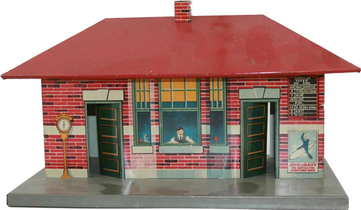
The 100 Station first appears in a c. 1921 Foldout that was produced by American Flyer (See scan). This foldout is dated to 1921 due to the absence of the 3020 locomotive appearing in the foldout and that the boy on the front of the foldout is shown holding a 1218 locomotive instead of the 3020 locomotive. The 3020 locomotive is used in all advertising from 1922 and on and the boy holding the 3020 locomotive artwork is shown on the front of the 1922-1924 catalogs. The 100 Station last appears in the 1924 catalog and is replaced by the similar 101 Station in the 1925-1927 catalogs. According to the Greenberg’s “American Flyer Wide Gauge” book, which features the accessories, the 101 station first appears in the October 1924 Dealer’s Price List, so it may have been a transitional item from 1924 to 1925.
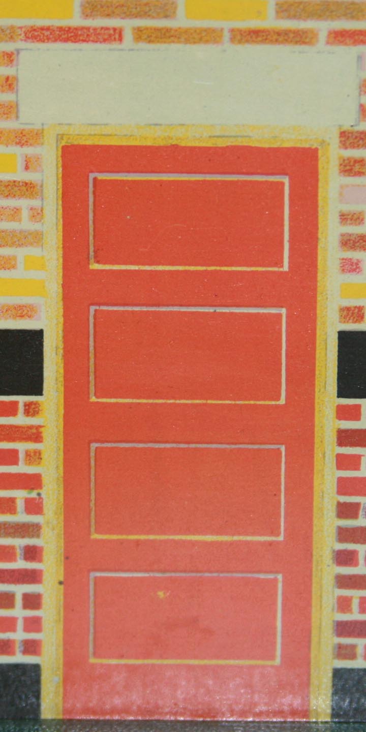
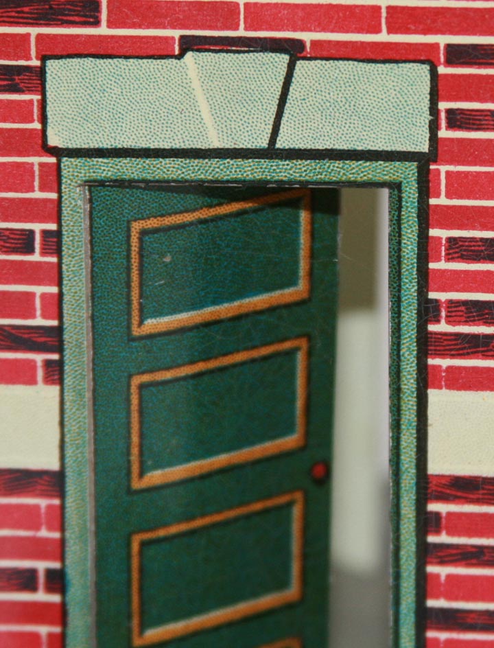
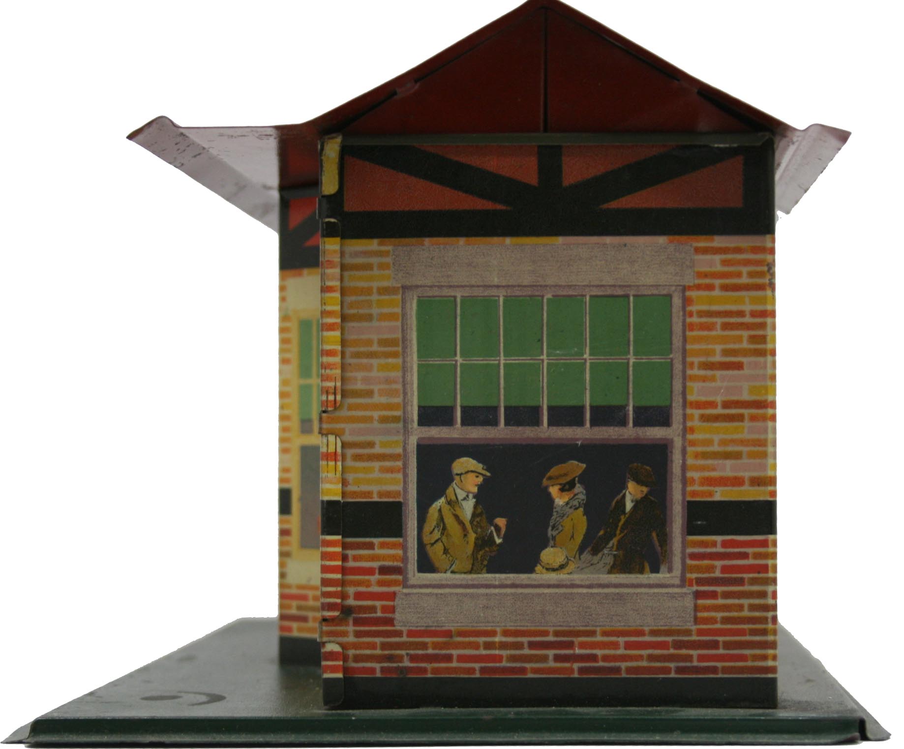
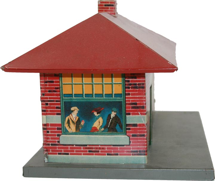
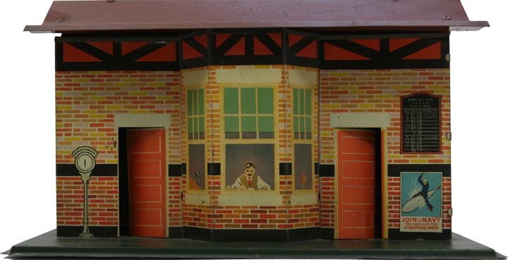
The 100 Station is a very attractive station that has a bay window at the front that is a separate section of steel. It is interesting to note that the bay window is also shown at the back of the station, but here it is simulated with shading to create the bay window look. This is particularly interesting when one considers that the separate bay window section at the front required a different lithograph press than the body of the station, as it is not shaded like the body of the station. The 100 station also has a base that is somewhat crude in comparison to the later American Flyer bases and has a roof that is a gable roof style instead of the hip roof style of the later larger sized stations that American Flyer made. American Flyer also added chimneys to its larger stations that were produced after the 100 station.
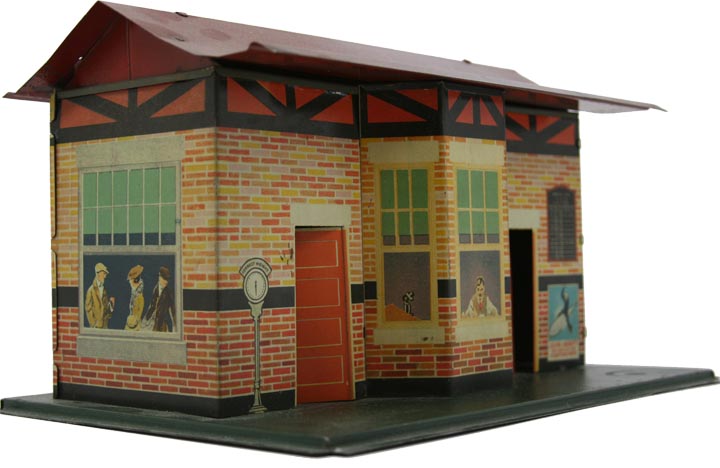
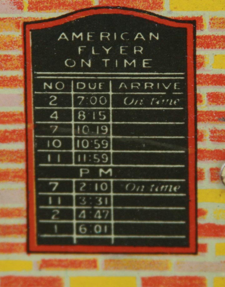
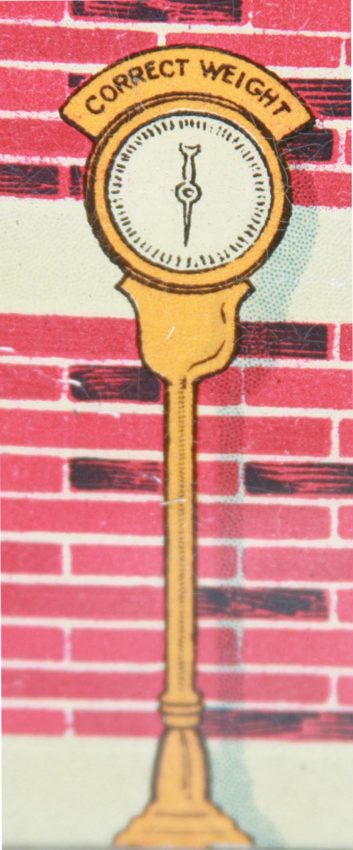
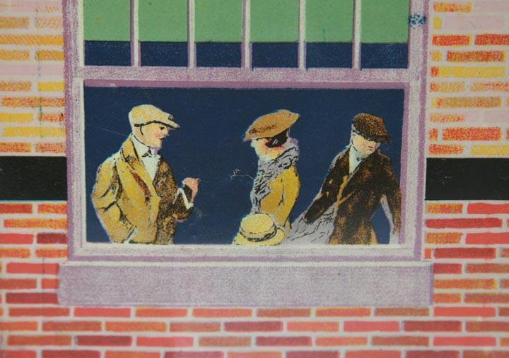
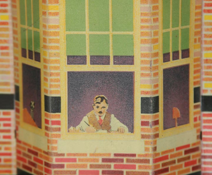
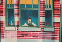
Attractive features of these stations are the people/objects that are shown in the windows and the items shown on the front/rear of the building. There is a ticket agent at the front of the bay window section and there is a phone to his right and a desk lamp to his left. The sides of the station show 3 people in the apparent waiting room of the station. In addition to the US Navy poster, there is a schedule board above the poster and a scale indicating “Correct Weight” at the other end of the front/rear side of the station. The station also has an attractive brick pattern that is more reddish at the bottom, with bricks that are more orange/yellow toward the upper section (above the black band) and finally, a timbered section at the very top of the walls.
As I began to research material for this article and photograph my 100 and 101 American Flyer stations, I did not realize where the information would take me and have been astonished at what I learned about these stations. Like many who casually glance at these stations, I initially thought that the 101 station was just the 100 station that had a different base and roof; did not feature the additional bay window section; and was missing the timbered section of the lithograph that is just below the roofline on the 100 station.
However, I came to realize that casual glances at these stations can be misleading. These stations are best described like the picture puzzles one sees that challenge one to spot 5 differences between two apparent identical pictures.
I believe that the 101 station’s lithograph was designed to replicate the 100 station, but with brighter colors and to update the base and roof of the station. It is my opinion that the redesign of this lithograph for the 101 station
failed to capture the quality of the earlier 100 station.
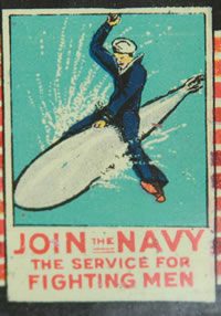
My first observation of the decline in the quality of the lithograph between the 100 and 101 stations has to do with the US Navy recruiting poster that is shown on both stations. Being a US Navy veteran, I have always liked these stations because of this poster in the lithograph. The poster, showing a sailor riding a torpedo with the tagline of “Join the Navy, The Service for Fighting Men”, is based on an actual recruiting poster that was created by Richard Fayerweather for Babcock (possibly the advertising company) in 1917 for WWI

It was when I compared the actual poster to the two stations that I realized the two stations were not identical lithographs. The 100 station captures the detail of the original poster (although the sailor’s raised hand is cutoff on the station). One sees the sailor with his left hand on the torpedo body holding the reins like he was riding a horse, as in the original poster. He is looking in the direction that the torpedo would be going and has his right arm raised. The torpedo has a uniform shape that is rounded at the front and tapered at the rear. The lettering of this poster is crisp and finely detailed.
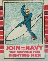
Unfortunately, when one views the same poster that is part of the 101 station lithography, one instead sees a poorly drawn representation of the original poster. First off the sailor’s face is now looking at the viewer of the poster. The sailor’s body, hat, hands, uniform, and feet are poorly drawn. Additionally, the torpedo is no longer rounded at the front, but it is more pointed. Lastly, one notices a dramatic decline in the lithograph as the blue color is now comprised of blue dots and is not a solid blue background. The lettering of this poster is not fine and crisp, but is poorly defined. I suppose the blue dots in the background and the lettering of the poster may just be my particular station, but the remaining differences to the poster are significant if directly compared to the 100 station.
Other notable differences between the two station’s lithographs include: the schedule board, which has fewer lines on the 101 station and is shaped different; the scale is drawn slightly differently on both stations; the people in the windows are drawn slightly different between the two stations; the lintels above the doors and windows are different between the two stations; the bricks are a uniform reddish color on the 101 station.


After comparing these stations for this article, I can say without a doubt that the 100 station is my favorite American Flyer station. I think that the lithograph on this station is one of the best lithographs by American Flyer.